a) identify the source of the map
b) describes what the map shows
c) discusses what you find interesting about it
d) identify what kinds of data were necessary to create the map.
Map # 1 Interactive Map Showing Immigration Data Since 1880
http://www.nytimes.com/
This map is from the New York Times website. It is an interactive map which allows you to view, by year, where immigrants settled, by county, in the United States. The map includes some filters, such as selecting one or more country of origin. You can select how you want some of the data displayed, choosing between view by number of residents or percent of population. I find this map of interest because I have been researching early townships and abandoned cemeteries in Illinois. As I perform genealogical research on individuals buried in these cemeteries I often come across concentrations of immigrants. This map allows me to see, on a larger scale, immigration into the United States and, specifically, by county in Illinois. To create this map vector data, such as the geographic boundaries of the US and individual states, was needed. Also needed was attribute, or non spatial data, such as population statistics by county by year and country of origin information for immigrants to the US. Since the dates are in 10 year increments, (1800, 1890, 1900, 1910 etc). it appears census data was probably the source of this information.
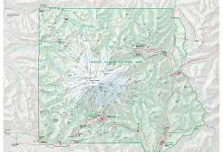
Map #2 Mount Rainier National Park Map
http://www.nps.gov/pwr/
This map is from the National Park Service website. It illustrates the features found in and near Mt. Rainier National Park. This map is presented in pdf format. The viewer allows you to zoom in and out and pan left and right or up and down. I used this map to plan a 10 day backpacking trip around Mt. Rainier along the Wonderland Trail. The map is informative because it shows where the highway meets up with the trail, the location of ranger stations where we could pick up our permits and wilderness patrol cabins where we could seek back country assistance. More importantly, it shows where campsites are located along the trail so I was able to plan an itinerary of how many miles we would hike each day and where we would camp at night. Additionally, from viewing this map I was able to identify where family could meet up and hike with us along the trail and where to send our food and fuel caches. Lakes, creeks, glaciers and peaks (including elevation) are also identified on the map. While this map is not detailed enough to navigate by along the trail, it is an excellent map for planning purposes. To create this map vector data was needed to identify all the features the NPS felt were applicable to include Some of these features are: highways, trails, rivers, lakes, glaciers, campgrounds, ranger stations, etc. Surface information, such as elevation and slope, was needed to identify the elevations at certain peaks and to create the topographic quality of the map.
Map #3 Mid-Wilshire Crime - Mapping L.A.
http://projects.latimes.com/
This map is from the Los Angeles Times website. The map shows, by neighborhood, various violent and property crimes. You can search by date and neighborhood. Clicking on a specific crime will pull up details from the filed police report. I find this map interesting because it is an excellent way to display crime statistics, not only to make citizens more aware of their surroundings but also for police to concentrate patrol efforts. To create this map vector data was needed to show streets, parks, etc. Additionally, crime statistics by location are needed.


No comments:
Post a Comment