Thursday, September 22, 2011

Lab #4 - More with projections & data formats

Map with three datasets projected


In ArcCatalog I made sure all three data sets were using the same x,y coordinate system:  NAD_1983_UTM_Zone_11N.  I then copied the files over to ArcMap. In ArcMap I went to projections and transformation and then to the define projection tab and made sure all three data sets were projecting in the same system.


Questions:

1. Open the folder where you saved the three datasets from Part I using ArcCatalog. Each one is a vector dataset. What type of vector dataset is each one?
2. As discussed in class, there are a few general file types a vector dataset can be saved to, including shapefiles, coverages, and feature classes. Which of these are used to save each of the three datasets?
3. Now minimize ArcCatalog. Open the folder where your data is saved using Windows Explorer (this is when you search your “My Documents” folder for files not pertaining to this course). You should see a number of different files associated with each of the caves, streams, and marble datasets. Name all six extensions you see. They should be the same for all three datasets.
4. Open any of the .prj files. What information is given?
5. Using the lecture, your textbook and ArcGIS Help, define what each of the following file types:
- .shp
- .shx
- .sbn
- .prj
- .dbf
6. What type of data do you suppose the .dbf file extension contains?
7. Go back to ArcCatalog and you should see the Mineral King geodatabase. We will talk in detail about geodatabases later, but what happens when you open the geodatabase?  Name all the “feature classes” present when the geodatabase opens.
8. Now save the geodatabase to your personal drive. Then, navigate to the geodatabase using Windows Explorer. What program is prompted to open is you tried opening the gdb (geodatabase) from here?
9. Similarly, export the raster layer “MineralKingNE03c” to a personal folder. Using ArcCatalog, what happens when you click the “+” button to the left of the raster layer. Describe what you see.
10. Now go back to Windows Explorer and view this same raster layer. How many separate files do you see and what are their extensions?
11. Using your textbook and ArcGIS Help to figure out what these extensions mean and describe them.

Answers:


1.  Caves are points, Marble are polygons, Streams are lines

2.  The caves, marble and streams are all shapefiles. 

3.  6 file types are:  Dbf. Prj. Sbn. Sbx. Shp. Shx.

4.  Prj files provide coordinate system information

5.These definitions are taken from the shapefile file extensions section on ArcGIS 10 Help
- .shp - The main file that stores the feature geometry; required.
- .shx -  The index file that stores the index of the feature geometry; required.
- .sbn  - The files that store the spatial index of the features for shapefiles that are read-only.
- .prj  - The file that stores the coordinate system information; used by ArcGIS.
- .dbf - The dBASE table that stores the attribute information of features; required.

6.  Attribute data in a table format

7.  The mineral king geodatabase has feature datasets, such as boundaries, geology, hydrography, infrastructure, karst, vegetation and raster datasets such as aspect, dem, hillshade and slope. 

8. When I attempt to open the mineral king geodatabase folder through Windows Explorer it prompts to use Microsoft Access.

9.  When I add the mineralkingNE02c.sid file to ArcCatalog I am able to view three raster band files in the content tab. 

10.  When I view MineralKingNE03c through Windows Explorer I see 5 files – they end in aux, sdw, sid, sid.aux, and sid.

11.  These definitions are taken from the auxiliary files section on ArcGIS 10 Help and this site:  http://forums.arcgis.com/threads/7730-How-do-I-use-a-.sid-raster-file

- .aux - an auxiliary file accompanies the raster in the same location and stores any  auxiliary information that cannot be stored in the raster file itself.
- .sdw - text document
- .sid is the raster.  It contains georeferencing information that maps the raster image data in the sid file to coordinates
- .sid.aux  – holds metadata
- .sid – holds metadata

Thursday, September 15, 2011

Lab #3 Exercise 13

Map  13a

Map 13a playing with the legend/colors
Map 13b step 5
Map 13b
Map 13b playing with the legend/colors
Questions for Exercise 13
1. Which projection(s) is/are used in exercise 13a?
2. Each dataset has a defined “datum”, but is not necessarily projected. After going through the tutorial, which datum seems to be the most common? (We will discuss projections and datums in class).
3. Using the internet, what is the largest U.S. state in area?
4. In step 19 of exercise 13a, which state appears largest?
5. Export a separate map following step 5 in exercise 13b.
6. Once you have correctly established the matching projections, describe the off-set between the Albers and Lambert projections in exercise 13b as seen in step 5 (for example, where are the cities located on the diagram in relation to their actual locations). Use your two maps for comparison.

Answers for Exercise 13

1.  In exercise 13a three versions of the Albers equal area conic projection are used.  Each of the three data frames use the Albers equal area conic projection, but the projection settings are customized for each to represent the area of interest as accurately as possible. 
2.  The shapefile  of the U.S. states (Datum NAD83) is used in all three data frames, but different projected coordinate systems are used for each data frame.
3.  The largest U.S. state in area is Alaska at 663,267.26 square miles.
4.  Texas appears to be the largest U.S. state at step 19 in exercise 13a.
5.  see above
6.  The layout view of the Lower 48 before and after projection differs in that before the projection all the cities appear east and south of their actual geographic locations.  The city locations show properly after the projection is changed to North American Lambert Conformal Conic. 


Thursday, September 8, 2011

Lab #2 Exercise 4

Print Screen for exercise 4a

Print Screen for exercise 4b

Map for exervise 4c

Questions and Answers for Exercise 4

Chapter 4 Questions
1. Name the feature classes you use in exercise 4a.
2. Using the “info”, click on Australia and give the country population.
3. Which dataset would you use to determine the depth of the ocean in exercise 4b?
4. What file type is the particular file in number 2 (in other words, what’s the file extension)?
5. Describe what a Dataframe is.
6. What is the focus of the second data frame?

Chaper 4 Answers

1)  The feature classes used in exercise 4a are cities, countries, disappearance area and world 30.
2)  According to the identify results window, the population of Australia is 17,827,520.
3)  Seafloor.tif
4)  I think you are asking about question 3.  It is a tif file.
5)  A data frame is a set of data.  A map can have one or many data frames. 
6)  The focus of the second data frame is Earhart’s Area of Disappearance.  This map layers the diverging flight paths (planned & probable) as well as the disappearance area and Seafloor elevation. 


Lab #2 Exercise 3

Map for Exercise 3a

Map for Exercise 3b

Map for Exercise 3c

Chapter 3 Questions & Answers

Chapter 3 Questions
1. Following step 7 in exercise 3a, suggest an appropriate order for each data layer from top to bottom?
2. Name all of the US Cities along Earhart’s path.
3. Name five other countries Earhart flies over.
4. Where was the end of Earhart’s “planned” flight path?
5. Use the “Measure” tool to calculate the distance between Earhart’s planned flight finish and probable finish (the difference between the end of the planned route and probable route).
6. What is the name of the island she should have completed her journey?
7. In exercise 3c, use the attribute table to find how many cities Earhart visited during her journey.
8. Sort the “Length” field of Earhart’s journey. What was the shortest leg?
9. What was approximately the longest leg of her flight?


Chaper 3 Answers

1)  Since data is displayed on the graphic user interface based on the order listed in the table of contents, I suggest this order top to bottom:  graticule, cities, flight path and then countries.  

 2)  The US cities along Earhart’s path were Oakland, Tucson, New Orleans and Miami.

3)  Five countries along Earhart’s flight path were Puerto Rico, Venezuela, Brazil, Senegal and Sudan.  

4)  The last stop Earhart had made was in Lae.  The end of Earhart’s planned flight path (the next stop on her journey was:  Howland Island.  2,322,325.166  89,158.068 Meters.  From Howland Island she planned to go on to Hawaii and the back to California.

5)  Calculated distance between Earhart’s planned flight finish and probable finish is 768,552.744109 meters.
6)  Howland Island

7)  Earhart visited 28 cities during her journey.

8)  The shortest leg of Earhart’s journey was from St. Louis to Dakar.

9)  The approximate length of Earhart’s longest leg was from Natal to St. Louis , 3184.838 meters.

Wednesday, September 7, 2011

Lab # 1 My Google Map

My Google Map


Lab #1 Find three cool maps on the web

For our first GIS lab assignment we have been asked to find three maps online that we find of interest and then we are to:

a) identify the source of the map
b) describes what the map shows
c) discusses what you find interesting about it
d) identify what kinds of data were necessary to create the map.

Map # 1 Interactive Map Showing Immigration Data Since 1880
http://www.nytimes.com/interactive/2009/03/10/us/20090310-immigration-explorer.html


This map is from the New York Times website. It is an interactive map which allows you to view, by year, where immigrants settled, by county, in the United States. The map includes some filters, such as selecting one or more country of origin. You can select how you want some of the data displayed, choosing between view by number of residents or percent of population. I find this map of interest because I have been researching early townships and abandoned cemeteries in Illinois. As I perform genealogical research on individuals buried in these cemeteries I often come across concentrations of immigrants. This map allows me to see, on a larger scale, immigration into the United States and, specifically, by county in Illinois. To create this map vector data, such as the geographic boundaries of the US and individual states, was needed. Also needed was attribute, or non spatial data, such as population statistics by county by year and country of origin information for immigrants to the US. Since the dates are in 10 year increments, (1800, 1890, 1900, 1910 etc). it appears census data was probably the source of this information.

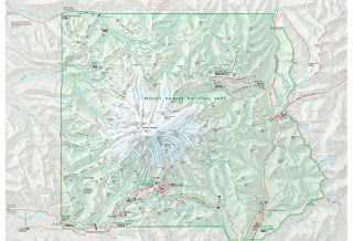
Map #2 Mount Rainier National Park Map
http://www.nps.gov/pwr/customcf/apps/maps/showmap.cfm?alphacode=mora&parkname=Mount%20Rainier%20National%20Park

This map is from the National Park Service website. It illustrates the features found in and near Mt. Rainier National Park. This map is presented in pdf format. The viewer allows you to zoom in and out and pan left and right or up and down. I used this map to plan a 10 day backpacking trip around Mt. Rainier along the Wonderland Trail. The map is informative because it shows where the highway meets up with the trail, the location of ranger stations where we could pick up our permits and wilderness patrol cabins where we could seek back country assistance. More importantly, it shows where campsites are located along the trail so I was able to plan an itinerary of how many miles we would hike each day and where we would camp at night. Additionally, from viewing this map I was able to identify where family could meet up and hike with us along the trail and where to send our food and fuel caches. Lakes, creeks, glaciers and peaks (including elevation) are also identified on the map. While this map is not detailed enough to navigate by along the trail, it is an excellent map for planning purposes. To create this map vector data was needed to identify all the features the NPS felt were applicable to include Some of these features are: highways, trails, rivers, lakes, glaciers, campgrounds, ranger stations, etc. Surface information, such as elevation and slope, was needed to identify the elevations at certain peaks and to create the topographic quality of the map.

Map #3 Mid-Wilshire Crime - Mapping L.A.
http://projects.latimes.com/mapping-la/neighborhoods/neighborhood/mid-wilshire/?q=Los+Angeles%2C+CA+90019%2C+USA&lat=34.0489277&lng=-118.3403506&g=Geocodify


This map is from the Los Angeles Times website. The map shows, by neighborhood, various violent and property crimes. You can search by date and neighborhood. Clicking on a specific crime will pull up details from the filed police report. I find this map interesting because it is an excellent way to display crime statistics, not only to make citizens more aware of their surroundings but also for police to concentrate patrol efforts. To create this map vector data was needed to show streets, parks, etc. Additionally, crime statistics by location are needed.